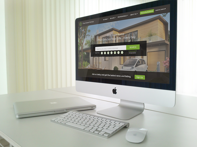
VIVA GREEN HOMES
MY ROLE: UX DESIGNER
TEAM: MOLLY FU, SHELDON MOJICA
DURATION: 2.5 WEEKS
TOOLS: SKETCH APP, INVISION, PHOTOSHOP
GOAL
Viva Green Homes is a niche realty site that connects buyers, sellers and realty agents in the eco-friendly housing market, promoting opportunities and education for consumers and matching them with experienced professionals in the market.
PROBLEM
Viva Green Homes is looking to tackle multiple components of site optimization and improvement. One piece, the primary focus of this project, is to research, develop and optimize a lead generation feature of their site. As vivagreenhomes.com aims to match buyers/sellers in the eco-friendly housing market with agents who are experienced in the industry, the importance of educating users on the value of these specific agents is paramount. This feature is currently live in the “find a professional” pages listed throughout the site, however the feature flows, the efficiency and effectiveness of this tool in converting leads is the primary goal in mind. Ultimately, Viva Green Homes needs to be able to drive users to agents and convince sellers to buy into the product.
SOLUTION
Creating a seamless and instinctive professional discovery experience for new and existing customers is the goal. users navigate the “find a professional” section to easily find options, buy/sell and connect with agents that are the best fit for their need without complications or distractions.
RESEARCH PROCESS
MARKETING RESEARCH | USER SURVEY | COMPETITIVE ANALYSIS | PAIN POINTS |
VIABLE SOLUTIONS | PERSONAS

WHO IS VIVA
Viva green home was founded in 2014 by Kari Klaus. Kari has more than 10 years experience in real state field. And she’s a LEED Green Associate EcoBroker.

USER SURVEY
Understanding millennial’s buying behaviors, donation habits, and purchasing power and motivations.

MARKETING RESEARCH
Viva Green Home fills a large gap in the real estate market. Based on reports, 10m millennials will be home searching by 2018. Eco home will double in home sales. More and more buyers are starting to pay attention to eco-features when conducting their research. Viva green home provides a professional, eco featured focused global platform.

USER SURVEY
During our initial user screen survey, we noted that 70% of consumers care about the eco-friendly features when home searching. But, only 25% of them are aware of what exactly “eco friendly” features are.
This finding really got our attention, and focused our interest on how to educate the users, and thus encourage them to further explore the website.
We then conducted another survey targeting the realtor. Agents chief complaint was how costly and ineffective the leads are. Research shows that presently, realtors have monthly subscriptions to major real estate websites. But useful leads are increasingly less frequent. However, they would gladly pay for a valuable, effective lead.

COMPETITIVE ANALYSIS
We followed up by researching our competitors. Only one competitor, "green homes for sale”, has a section to educate users about “eco-friendly” features, - but the contents are very basic, and limited.
USABILITY TEST
We followed up by conducting another user-ability test of Zillow and Homelight, focusing on their lead generation features, and noting both pros and cons.
This is a video record of one of our user-ability tests.
The feedback did highlight some valuable results. Most users quit before inputting their contact info.

PAIN POINTS
- How to educate users about “eco-friendly” features?
-
How to earn the users trust?
-
How to more effectively pair the consumer with a professional?
VIABLE SOLUTIONS
-
Redesign the homepage of “Viva Green Home”
-
Add “About Us”, “Feature of Viva”, and “blog” (Phase II)
-
Add new feature, “Find a Professional” by inserting "lead generation" form
**What is "lead generation"? It is “collecting information from a potential user/customer”. Here is a listing of the cost for each lead. In marketing agencies field, its “51-100”/lead.

PERSONAS
We created two personas based on our research, a buyer and a seller/buyer.
During the presentation, I use “Danny”, the seller/buyer, to go through the prototype, so the audience can have a clearer picture of what the user flow looks like for a “real user”.
DESIGN PROCESS
SKETCHING | A/B TESTING | ITERATION | WIREFRAME | PROTOTYPE
SKETCHING
Based on the research our team conducted, we sketched the first user flow by a storyboard and the on-boarding page, for the new feature we designed.

A/B TESTING
Based on competitive analysis, we came up with two user flows. To determine which is more usable, we conducted an "A/B testing”.

FEEDBACK AND ITERATIONS
After we conducted AB testing and usability testing, we determined which flow would be used. Also, we gained some useful ideas during the test. Here are two major iterations.
-
Added “find a professional” on the header. Based on the research and testing, it occurred to me that the website should have a CTA button to encourage users to search, explore and investigate what options are available to them to find their “significant other agent”.
-
Added a “skip” option into the flow of “find a professional”. Users should have the option to exit the flow and explore the website more.

USER FLOW

PROTOTYPE
FUTURE PLANS

